The color is one of the most effective and diverse tools in the disposal of a designer. It is so much more than the mere act of making something look nice; color can convey messages, create moods, and subconsciously make decisions. You may be designing a logo, looking for a color combination for website, an interior decoration, a fashion line, a product package, or a branding campaign, but the color you use and the combination of colors may have a long-lasting impact on your viewers. The correct combination of colors can trigger certain emotions, like trust, excitement, calm, and even nostalgia, and can even predispose certain actions, both in making people buy or becoming brand loyal.
It is a strategic way for designers to use color to tell a story visually, provide hierarchy, bring emphasis to significant parts, or provide navigation in a space or interface. Between bright, contrasting color combinations that are striking and muted, and harmonious color schemes that are elegant and balanced, it is necessary to know more about the psychology of color and color theory. It is also significant to follow fashionable color combinations, where modern customers tend to react to the pallets that are new, up-to-date, and valuable.
This guide can be considered the best 30 color combinations, some of which are just timeless and will not become outdated, and some are the popular ones in 2025. Both pallets will contain helpful tips on how to apply them, digital and print design hex codes, and an explanation of how to apply the pallets to fashion and home decor, branding, and web design. This guide will offer a wealth of ideas to any designer, whether experienced, novice, or someone just seeking some sort of inspiration to make a dazzling, cohesive, and impactful design, regardless of whether it is for the next creative project or not.
Also read: Color trading apps
Learning the Psychology of Color
Color is not a visual option. Colors are related to emotions, mood, and even culture in human beings. For instance:
- Red: A power, lust, enthusiasm, rush. Best with fast food branding, retail marketing, or dynamic lifestyle goods.
- Blue: Fidelity, calmness, business. Applying in finance, technology, medical, and corporate branding.
- Green: Environment, peace, and endurance. Typical of the eco-friendly products, wellness, and outdoor brands.
- Yellow: Good mood, cheerfulness, good feeling. In playful, youthful, or food-related designs, it is often found. Ideal for hall wall color combinations.
Designers do not mix colors freely and produce certain emotions. This is where the color theory and color wheel will intervene.
Color Theory Essentials
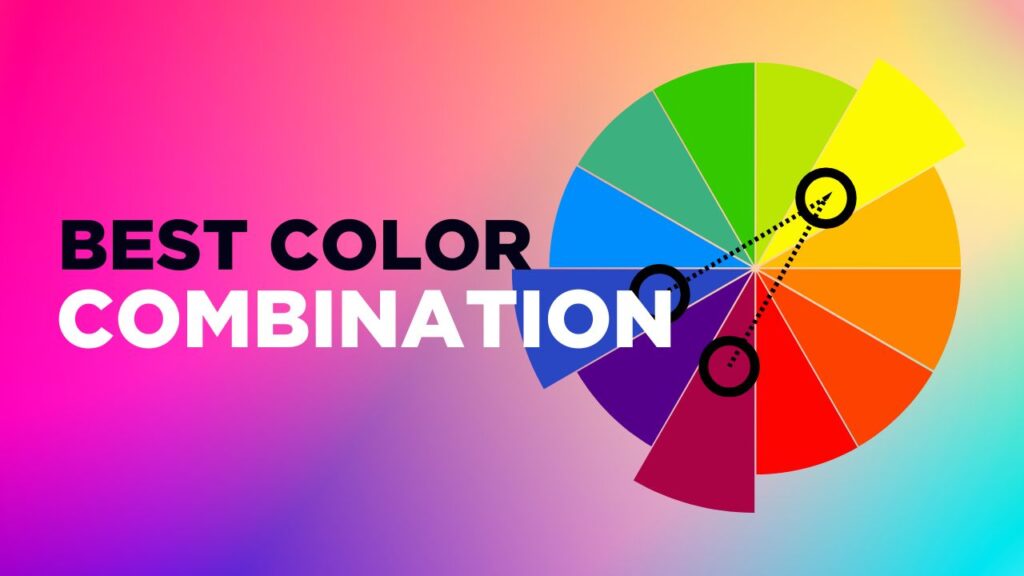
The theory of color is the interaction of colors and their psychological impact. It classifies colors into three:
- Principles Colors: red, yellow, blue.
- Secondary Colors: Orange, green, violet (primaries mixed)
- Tertiary Colors: Red-orange, yellow-orange, yellow-green, blue-green, blue-violet, red-violet.
The warm colors (reds, yellows, oranges) and cool colors (blue, green, violet) are necessary to understand. The warm colors introduce vitality and refreshingness, whereas the cool colors depict relaxation and elegance.
A Guide to Mixing Colors: Color Schemes and Techniques.
There are several strategies involved in matching colors:
Complementary Colors:Colors that are opposite to one another in the color wheel (e.g., red and green) are used to produce high contrast and visual interest.
Analogous Colors: Colors which are adjacent on the wheel (e.g., blue, blue-green, green) are said to be harmonious and cohesive.
Triadic Colors: Triadic colors are colors found on the wheel at equal distances (e.g., red, yellow, blue).
Tetradic Colors: Four colors on the wheel, giving a rectangle or square, are sufficient to make a vivid palette.
Knowing these tricks, the designers can choose the ideal color combinations for websites, branding, fashion, interiors, and home decor.
Classic and Timeless Color Combinations
1. Cherry Red and Bubblegum Pink:

Extra mild, playful, and assertive. Both colors are luminous and warm, making a young, dynamic palette. Fashion, lifestyle, and beauty products work well.
Hex: #CC313D, #F7C5CC
2. Dark Charcoal and Bright Yellow:

A very eye-catching combination of a neutral color, combined with a vivid accent. The dark charcoal brings out grace and stability, whereas the yellow brings in enthusiasm and hope. Perfect in the case of modern websites, urban branding, or sportswear.
Hex: #101820, #FEE715
3. Cherry Red and Off White:

Classic, classy, and versatile. The use of cherry red is full of passion and energy, and the use of off-white in it is coupled with softness and sophistication. Ideal in luxury fashion, luxury dining, and love branding.
Hex: #990011, #FCF6F5
4. Sky blue, Bubblegum pink:

Fun, tender, and happy. The sky blue color is very soothing and open, whereas the bubblegum pink is very energetic and friendly. Best suited to products for children, toys, and educational brands.
Hex: #89ABE3, #EA738D
5. Salmon Pink and Soft Peach

Light, but classy. Salmon pink is a very cozy colour, with soft peach being a sophisticated one. Ideal with beauty, children’s products, and food packaging.
Hex: #F98866, #FFF2D7
6. Baby Blue and White:

Relaxing, pacifying, and believable. Baby blue conveys a sense of clarity and professionalism, and white brings in the sense of cleanliness and openness. Appropriate in the case of healthcare, childcare, non-profit websites, and wellness brands.
Hex: #8AAAE5, #FFFFFF
7. Deep Blue, Orange-Red, and Yellow-Orange

Lively, active, and daring. The palette is anchored with deep blue, with the oranges bringing the movement and excitement. Outdoor brands, adventure travel, and children’s products.
Hex: #375E97, #FB6542, #FFBB00
8. Dark Blue and Light Blue:

Monochromatic, sophisticated, and businesslike. This combination is impressive and makes it dependable and trustworthy to be used as a corporate brand, financial sites, and insurance organizations.
Hex: #00246B, #CADCFC
9.Blue and Pastel Pink:

Light and elegant, this palette is well-balanced between a sense of calm and liveliness. The pink shade is warm and welcoming, whereas blue is deep, and it gives stability and sophistication. The combination is particularly useful with beauty and wellness brands, children’s clothing lines, and soft-themed web interfaces.
Hex: #2F3C7E, #FBEAEB
10. Forest Green/ Moss Green:

Monochromatic and natural thematic. Forest green is a strong and stable color, and moss green brings softness and warmth to the elements. Ideal with environmentally friendly products, outdoor wear, and brands that are environmentally conscious.
Hex: #2C5F2D, #97BC62
11. Coral and mint green

Light-hearted, fresh and contemporary. Coral is energizing, and mint green is relaxing. Performs well with summer collections, fashion, children’s products, and lifestyle brands. Ideal for home colour combinations.
Hex: #FF6F61, #98FF98
12. Terracotta Red, Light Beige, and Muted Teal:

Natural, down to the earth, and classic. The use of terracotta, beige, and muted teal offers warmth, softness, and sophistication, respectively. Best in domestic and restaurant settings and wellness brands.
Hex: #B85042, #E7E8D1, #A7BEAE
13. Light Blue and Seafoam Green

Light and refreshing. Seafoam green is the color that implies the freshness of nature, and light blue is the color that makes people feel calm and serene. Fits well with the spa, travel, education, and wellness brands.
Hex: #C4DFE6, #66A5AD
14. Dark Green and Light Gray:

Unfussy, eternal, and elegant. Dark green is rich and full of natural beauty, as well as light gray, which dilutes the blend. Ideal mindfulness brands, organic products, and interiors.
Hex: #31473A, #EDF4F2
15. Teal Blue, Light Blue, and Light Gray

Cool, relaxing, and reliable. Teal and light blue are used to bring clear effects, and gray is used to bring a neutral effect. Finance, healthcare, technology, and company branding.
Hex: #1995AD, #A1D6E2, #F1F1F2
Fashionable and New Color Schemes
16. Pastel Olive Green and Salmon Pink

Complimentary and cozy. The olive green color reminds one of nature and balance, and the salmon pink gives the feeling of playfulness and energy. Perfect in the children category, healthy products, and the green branding.
Hex: #A1BE95, #F98866
17. Light Red and Yellow:

Lively, joyful, and young. This blend creates the feeling of a happy and energetic one, which is characteristic of ketchup and mustard, and it is best suited to food packaging and fast-casual restaurants, as well as brand positioning for children.
Hex: #F96167, #F9E795
18. Dark Reddish Brown, Taupe & Light Peachy Brown

Warm, natural, and warm. Dark reddish brown or coffee color brings the warmth, taupe brings the neutrality, and peachy brown makes the combination soft. Exquisite on hereditary brands, coffee houses, and handcrafted items.
Hex: #330000, #73605B, #D09683
19. Deep Periwinkle and Soft Lilac

Naughty and dainty. Dark periwinkle adds the effect of depth and soft lilac airiness. Ideal in case of beauty, spiritual, and wellness products.
Hex: #735DA5, #D3C5E5
20. Lavender and Warm Taupe

Smooth, relaxing, and harmonious. Lavender brings calmness and warmth, taupe offers nature and elegance. Ideal when it comes to interior, luxury goods, and wellness brands. One of the best colour combinations for bedrooms.
Hex: #E6E6FA, #D2B48C
21. Teal and light green even

Natural, and serene. Teal would add some sophistication, and light green would add freshness. Perfect fit in the health care, wellness, and green products.
Hex: #20948B, #6AB187
22. Mauve, Dusty Rose, and Soft Blue

Gray is mostly elegant, feminine, and soft. The colors are warm and elegant with mauve and dusty rose, and soft blue-gray balances the colors. Wedding, beauty, fashion, and interior works.
Hex: #962E2A, #E3867D, #CEE6F2
23. Dark Navy Blue, Bright Scarlet Red, and Light Lemon Yellow

Highly energetic, vibrant, and vivid. Navy blue helps to stabilize the palette, whereas bright red and lemon yellow produce playful contrast. Best with retro brands, sportswear, and food products.
Hex: #5031FF, #CB0000, #E4EA8C
24. Deep Navy Blue, Bright Red, and Pale Pink

Daring but practical. Deep blue is very elegant, red is lively, and soft pink is playful. Ideal in the fields of luxury fashion, design agencies, and sportswear.
Hex: #002C54, #C5001A, #FDF6F6
25. Dark Chestnut Brown, Burnt Sienna & Soft Cream
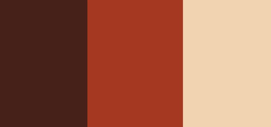
Grounded, natural, and warm. Dark chestnut is used to add depth, burnt sienna to add vibrancy, and soft cream is used to balance the palette. Perfect with organic goods, handicrafted brands, and interior design.
Hex: #46211A, #A43820, #F1D3B2
26. Cranberry Red and Bubblegum

Daring, playful, and modern. Intensity is offered by cranberry red, and playfulness by bubblegum. Very good with fashion, cosmetics, or candy wrapping.
Hex: #F52549, #FA6775
27. Dark Charcoal, Deep Rust, and Sky blue

Sleek, provocative, and contemporary. Dark charcoal and deep rust are used to add richness, and sky blue balances and softens. Luxury branding, architectural work, and fashion.
Hex: #2A3132, #763626, #90AFC5
28. Midnight Blue, Royal Blue, and Burgundy Red:

It is luxurious and sophisticated. Dark blue gives the color a feeling of opulence, and the use of burgundy gives the color a feeling of affluence and intensity. Best in high-end fashion, luxury vehicles, jewelry, and luxury hotels.
Hex: #1E2761, #408EC6, #7A2048
29. Golden Yellow and Slate Gray

Active, down-to-the-ground, and business-like. Golden yellow gives liveliness, whereas slate gray is modern and neutral at the same time. Tech, interior, and contemporary branding are perfect.
Hex: #FFD700, #708090
30. Blush Pink and Muted Teal

Classy and stylish. The purple blush is warm, and the dull teal is posh. Perfect in terms of beauty, lifestyle, and wellness products.
Hex: #F4C2C2, #5F9EA0
Tips for Using Color Combinations Effectively
Understand the audience:
Colours do not have the same meaning to everybody. One culture can have a color that is a sign of purity, but sadness in the other. Younger viewers can appreciate the use of bold and energetic colors, and older audiences tend to enjoy low-key sophistication. Find out about your audience to make an actual connection with colors.
The opposition of balance and harmony:
The complementary colors used form a contrasting effect and have a visual appeal, whereas the analogous colors used form harmonious effects. Determine whether your design must be striking or subtle and balance them.
Use tints, shades, and tones:
A palette can be added with various lighter (tints), darker (shades), and softer (tones) versions without adding new colors. This makes designs three-dimensional and does not make them appear two-dimensional.
Test across mediums:
Colors change to print, digital, and fabric. The screen’s bright teal can appear dull on paper. It is always necessary to test on various media to be consistent.
Limit your palette:
Too many colors overwhelm. Use 2-4 primary colors(some secondary ones). This brings a sense of clarity and brand recognition – consider the use of simple palettes by global brands.
Emphasize hierarchy:
Important elements should be done in bold or bright colors, and then the non-important ones in neutral colors. This leads to the direction of the eye of the viewer and emphasizes the most important ones.
Take into account seasonality and trends:
The colors vary over time, during the spring- pastel, during autumn- earthly, during winter- jewel tones. Be mindful of the changes of the seasons and the fashions of the house, and use the time-tested classics as a resource.
Conclusion
The selection of the appropriate room color combination, house color combination, color combination for living room, or even a color combination for dress is a science of art, and it needs creativity, psychology, and technical knowledge. A carefully selected palette is more than just a design that is beautiful; it spins a tale, it provides a vibe, and leaves a lasting impression on its readers. Since classic combinations such as black and white never go out of style, to eye-catching combinations made from the international fashion and interior design trends, color can change ordinary images into iconic ones.
The principles of the color theory, i.e., applying the complementary, analogous, triadic, or tetradic schemes, can be used to influence the way a viewer feels and reacts. However, design is hardly ever universal. The experimentation with the palettes in different platforms, adapting them to the audience, and mixing them with cultural awareness will guarantee the consistency of your work and also make it more impactful.
The 30 best color combinations that have been featured in this guide contain a mixture of a timeless, stable color with a modern touch, which is versatile to use in branding, web design, fashion, and home decor. When designers experiment, adapt, and make use of these palettes, they will find out that color is not its background; it is the soul of design itself.
The secret is, however, to find a balance between creativity and psychology. The colors should not merely appear to look aesthetically pleasing, but convey properly, lead emotions, and support identity. Color combinations can take designs to new heights when used in a considerate way- impressions that may be left on even after the initial look.
FAQs
1. Which is the most flexible color combination of branding?
Blue and white or dark charcoal and bright yellow are popular because they possess professionalism, visibility, and flexibility across sectors.
2. What is the choice of color palette of a site?
Begin with a base color, choose both complementary or related colors, and make sure that it can be read, contrasted, and aligned with brand power.
3. Is it possible to have more than three colors in a design?
Yes, but limit it to 4–5 colors. The additional colors are to be used as accents to ensure the balance, without overloading a viewer.
4. What are the trends to come in color combinations in 2025?
Colors of the trend include earthy, aqua color, nude color, toned down pastel, coral, vivid coral, mint green, and light lavender. The combination of these with neutral colors makes modern palettes.
5. How do I have a way of trying out color combinations before making them final?
Test the combinations in the real world by using digital tools (color palette generators, mockups, previews in various media) and observing their interactions in real-life applications.

